7 out of 10 OOH ads don’t work. Here’s why and how to fix them
By Andrew Tindall, SVP at System1 January 25, 2024
System1’s Andrew Tindall has been researching out-of-home effectiveness with JCDecaux for three years. His findings will shock you. No, that’s not clickbait. They really will.
In out-of-home (OOH) advertising, marketers have become obsessed with chasing shiny new things. They’ve forgotten the basics of connecting the media and creative dots. We end up in the pits of efficiency, pretending we are talking about effectiveness. And this isn’t my opinion; my research proves that seven out of 10 out-of-home ads aren’t working.
Here’s why.
When planning the OOH locations for your new campaign, you’re often advised to do two things.
Firstly, you carpet bomb as many spots as possible next to your office, hoping your CMO glimpses your work as they speed about in their Lamborghini. Savvy marketers know this guarantees a promotion better than any evaluation, effectiveness award or mixed media measurement study.
Secondly, you call up your sales team. They don’t answer because it’s 11am and they aren’t awake yet, but when they call you back later that week, you ask: “Can you send me the postcodes of the grocers we are activating in during March, please?”
To squeeze as much value as possible out of your OOH spend, you have a clever plan to increase salience as your customer walks to the shop. You have also been advised to add a trackable QR code with a tempting offer and seasonal message to the ad. Job done?
WHY THIS HAS LEAD TO OOH LOSING ITS WAY
The OOH ads are targeted, message-driven and measured with engagement metrics. It’s Groundhog Day for digital advertising. We proudly relegate OOH to the new media “it girl” everyone’s talking about, retail media, which should scare you to death.
If we use OOH to make your brand easier to buy there and then (physical availability), then by definition, it needs to be measured in efficiency, not effectiveness, relegating OOH to the pits of marketing alongside price discounts on shelf talkers.
The sector needs a U-turn, just like Meta had to do. In my last piece, I shared data from Meta showing media engagement doesn’t predict sales or brand effects, and 90% of sales happen later offline. It’s because this short-term fantasy totally undervalues media, failing to capture its whole value just like Les Binet has had to work with Meta to prove that 60% of in-feed digital ads’ ROI is in the long-term.
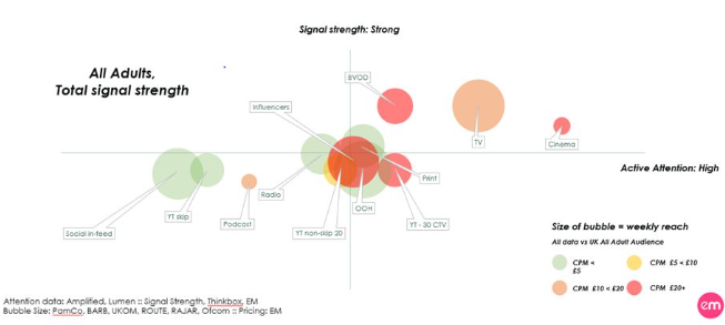
So, how do we ensure we are capturing all the beautiful value of your friendly neighborhood poster? You focus on its superpowers: broad, high-attention, trust-building quality reach. Cue the world’s most interestingly horrendous graph.
This is your media channel cheat sheet. Cheap channels are often small green bubbles (don’t reach that many people) on the bottom (weak “signal strength”) left (low attention). By “signal strength,” we mean possibly the only universally agreed thing advertising needs to do. Build fitness and social signals for a brand (ie, “I’m advertising, so I must be doing well, and all of your friends are talking about me”).
There in the middle is our old faithful OOH. Relatively high attention. Moderate signalling strength. And if we are to believe anything, Byron Sharp tells us (I’m scared even typing the Dark Lord’s name these days – in case he springs up behind me and shouts ‘Peer Reviewio’), very importantly… cheap huge mass reach. In fact, OOH claims to reach 98% of the UK population once a week.
We have ourselves the hallmarks of a brilliant brand-building media channel. Yet years of treating it like direct-response efficiency media have led to OOH advertising creativity getting thrown into a pit alongside all those Stanley sippy cups in three months. It’s brand building’s heyday, a distant relic that your grey-haired ad-land colleague won’t shut up about after too much whisky at the Groucho Club.
But the creativity-pits were just a hunch. As any good marketer would, I developed a new in-context pre-testing tool to understand and predict the effectiveness of posters with JCDecaux. Importantly, at first, the tool shows the poster to 150 people for the average time they are viewed in the real world, according to attention giants Lumen and TVISION (two seconds). They then get to look at it for longer if they want. This allowed us to capture realistic brand and emotion data. We tested a huge set of posters with over 7,500 people. The results are shocking.
Over half of the time, people had no idea what brand the OOH poster was even for. And 40% get a 1 Star in System1 testing, predicting very little long-term advertising effects, as they fail to build any sort of positive emotion. Now, everyone, get your calculators out. If only five out of 10 OOH ads are correctly linked to the brand. But two of those aren’t effective. Then… seven out of 10 OOH ads aren’t working. That’s a lot.
At this point, I felt an incredible warmth wash over me. No, Byron wasn’t giving me a shoulder rub. It was hope. Opportunity. We only had to improve the creative.
So here it is. Here’s ‘How to Keep Your Out-Of-Home Out of the Creative Pits.’
ACTUALLY CREATE OOH
It sounds mad, but marketers are obviously throwing their print and shop-activation creative on to posters and expecting them to work. This wonderful seasonal creative from Costa worked outside its Crouch End store at the weekend. Yum yum, warm milkshake. But it’s also used around London as OOH…
DON’T BE SCARED TO BRAND
JCDecaux worked with Lumen to understand how posters are viewed and trained an AI attention tool that I’m convinced is the only useful AI tool I’ve seen to date. In a second, it tells you what’s getting attention. This is your reward for reading this far. It turns out that if you put your brand at the top of the poster, it is recognized 20% more of the time. You could start doing that today.
BE REALISTIC
People aren’t pulling over to read your print ad slapped on a roadside bus shelter. You have two seconds. Brand bold, on top. Use distinctive big color swatches. Use less than 10 words.
CONSISTENCY
Extend your big-budget TV campaigns in OOH with real consideration for the role of broad public reach. At Christmas, we showed that doing this double’s brand recall. Take advantage of the power of integrated marketing communications. Fluent devices are a great way to achieve this, just like Aldi’s Kevin the Carrot.
NOW BE CREATIVE
We haven’t even talked about how to create lasting positive emotions.
The strategy, creativity and campaign are up to you. You’re on your own. I jest. You can get my full tips here, but in short. Use fluent character devices; play with your product and brand assets to bring in joy; be novel but use human emotion to be broadly appealing; and don’t forget actual advertising craft (make it visually enjoyable).
There it is. It’s a rather tiring point of view that’s taken me nearly three years to build. Some of you will he-and-haw about it being obvious. But how obvious can it be if so many marketers are getting it wrong? The key to being an effective marketer is being second best at everyone else’s job. Always interested, always connecting the dots and always pissing people off by asking why.
Just because we are out-of-home doesn’t mean we should chuck Martin Boase’s famous in-home thinking: “If you are going to invite yourself into someone’s living room you have a duty not to shout at them or bore them or insult their intelligence. On the other hand, if you are a charming guest and you entertain them or amuse them or tell them something interesting, then they may like you a bit better and then they may be more inclined to buy your brand.”


